Renewt3ch · Brand Guide
1. Brand Overview
Brand name: renewt3ch
A compact, tech-forward identity designed for a modern web studio / AI-first product business.
Positioning: “Futuristic, but approachable — premium design that ships fast.”
- Futuristic, not cold: gradients + clean geometry, minimal clutter.
- Technical, but friendly: readable type and strong spacing rhythm.
- Modular: assets work across web, product UI, and print handoff.
Logo-Renewt3ch.svg— gradient logotypewordmark-pure-white.svg— white wordmarkwordmark-black.svg— black wordmarkr3-icon-gradient.svg— gradient iconr3-icon-white.svg— white iconr3-icon-black.svg— black icon
/assets/logos
2. Logo & Wordmark Usage
Use Logo-Renewt3ch.svg on dark backgrounds for maximum clarity and premium feel.
Minimum recommended width (screen): 200px. Use the icon for UI or tight spaces.
wordmark-pure-white.svg→ dark/gradient backgroundswordmark-black.svg→ light backgrounds & print
Keep generous padding around logos. Avoid compressing/stretching.
3. Color Palette
Use these colors for UI accents, highlights, and CTAs. Keep the overall look dark + restrained.
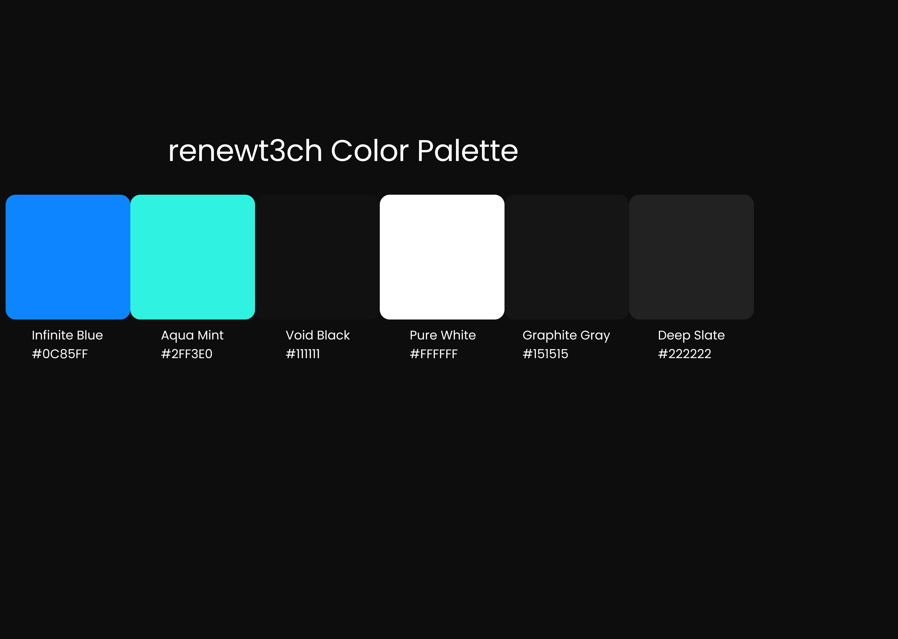
Palette image missing — swatches above are the source of truth.
4. Typography
Poppins for headings, titles, and premium “brand voice” moments.
--font-display (site) / --font-display token (brand.css)
Inter for body copy, UI, forms, and documentation clarity.
Inter, system-ui, -apple-system, Segoe UI, Roboto, sans-serif
- H1: 2.2–2.8rem · 700
- H2: 1.35–1.7rem · 700
- H3: 1.05–1.25rem · 600
- Body: 0.95–1rem · 400–500
5. Logo Preview
All preview tiles are dark so the set looks premium and consistent.


6. UI + Voice
- Dark-first surfaces with restrained highlights.
- 2 CTAs per page max (primary + ghost).
- Soft borders and controlled shadows for premium feel.
- Confident, not loud: no hype walls.
- Human + clear: short benefit-led copy.
- Modern: “shipping”, “system”, “tokens”, “handoff”.
- “Launch a premium site in days, not months.”
- “A brand system that scales from landing page to product UI.”
- “Clean. Lightweight. Ready for deployment.”